From start to finish, this rebrand is a true cybersecurity love story. I was lucky enough to be driving a dreamy rebrand SOW: messaging, CVI, website, paid media campaigns, swag, illustrations, and eventually a video ad campaign to launch it all. The original name stayed, the uppercase “G” did not.
Yet standing out in cybersecurity is no easy feat. We had tremendous chemistry with the client and were able to coach them towards actually being unique to their competitors.
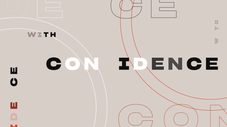
Saul Bass + ‘Q’ from James Bond + Cyber Security
Despite being a B2B brand, we snuck in trendy brand elements like some good, good typeface, gorgeous earthy color palette, and isometric illustration style.
When it finally came time for the video campaign, we steered voiceover and music to match the slick, mid-century modern motion design.
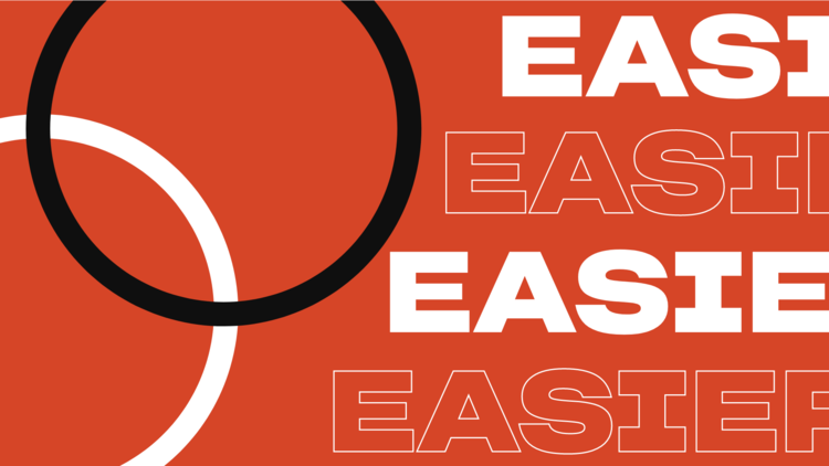


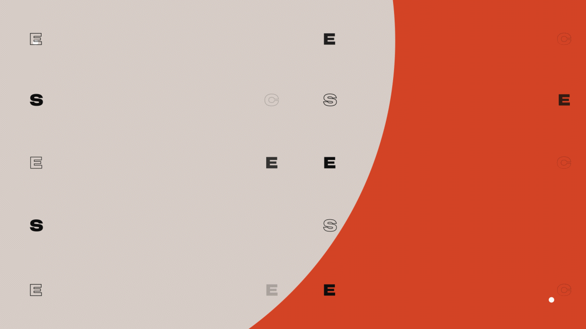
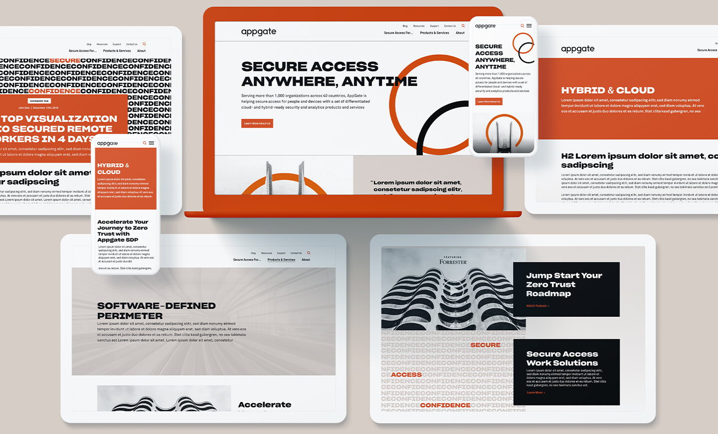
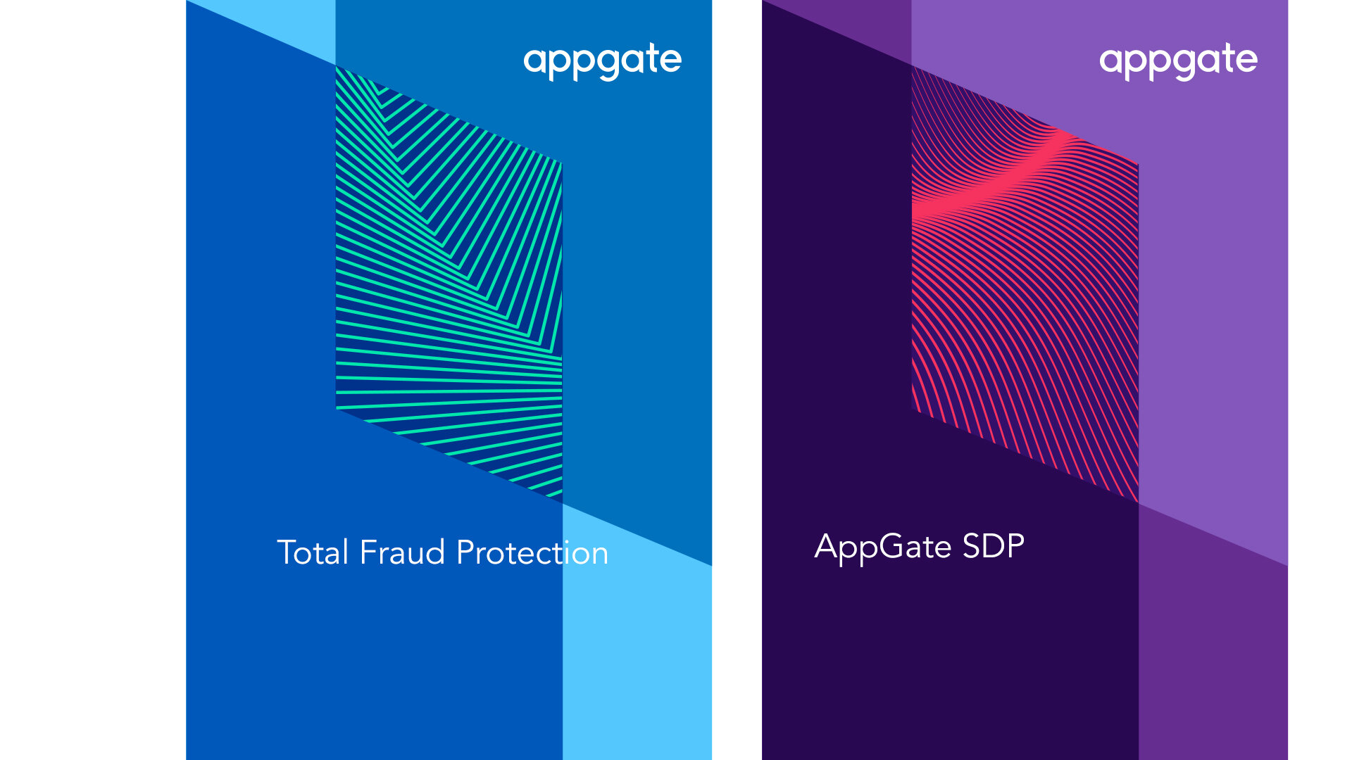
What Does ‘Software’ Look Like?
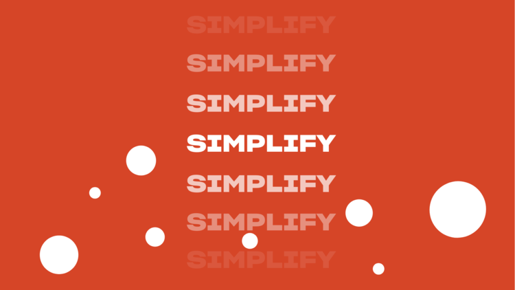
Not much visual low-hanging fruit here, so we broke the services down to the core purpose and emotional benefit — and then built them back up with some typographical personification and graphical narrative. That’s not what ‘automation’ actually looks like, but that easing though!
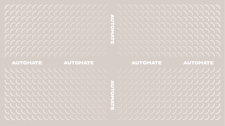
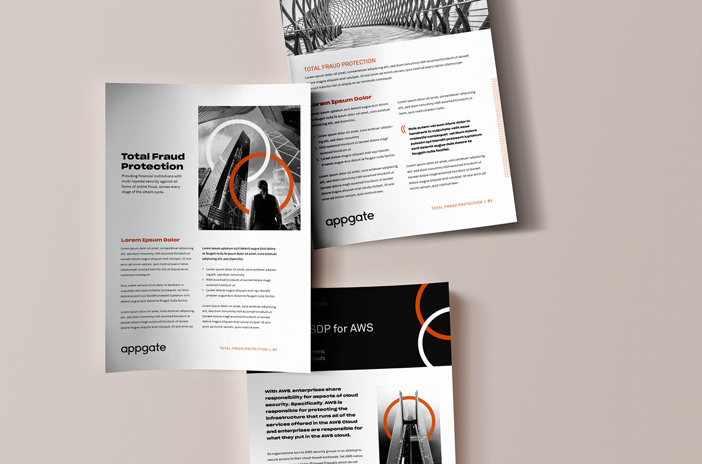
An Overwhelming Pursuit of Minimalism
The rebrand had to bounce between two pillars of the client’s creative preference: Confident and minimal. We needed to align with the messaging and portray confidence. At the same time, the goal was to remain minimal, focused, and straight to the point of their business. In the third round, after re-defining what ‘minimal’ actually meant to everyone involved, the team dug a bit deeper and finally nailed it.


Why It Works
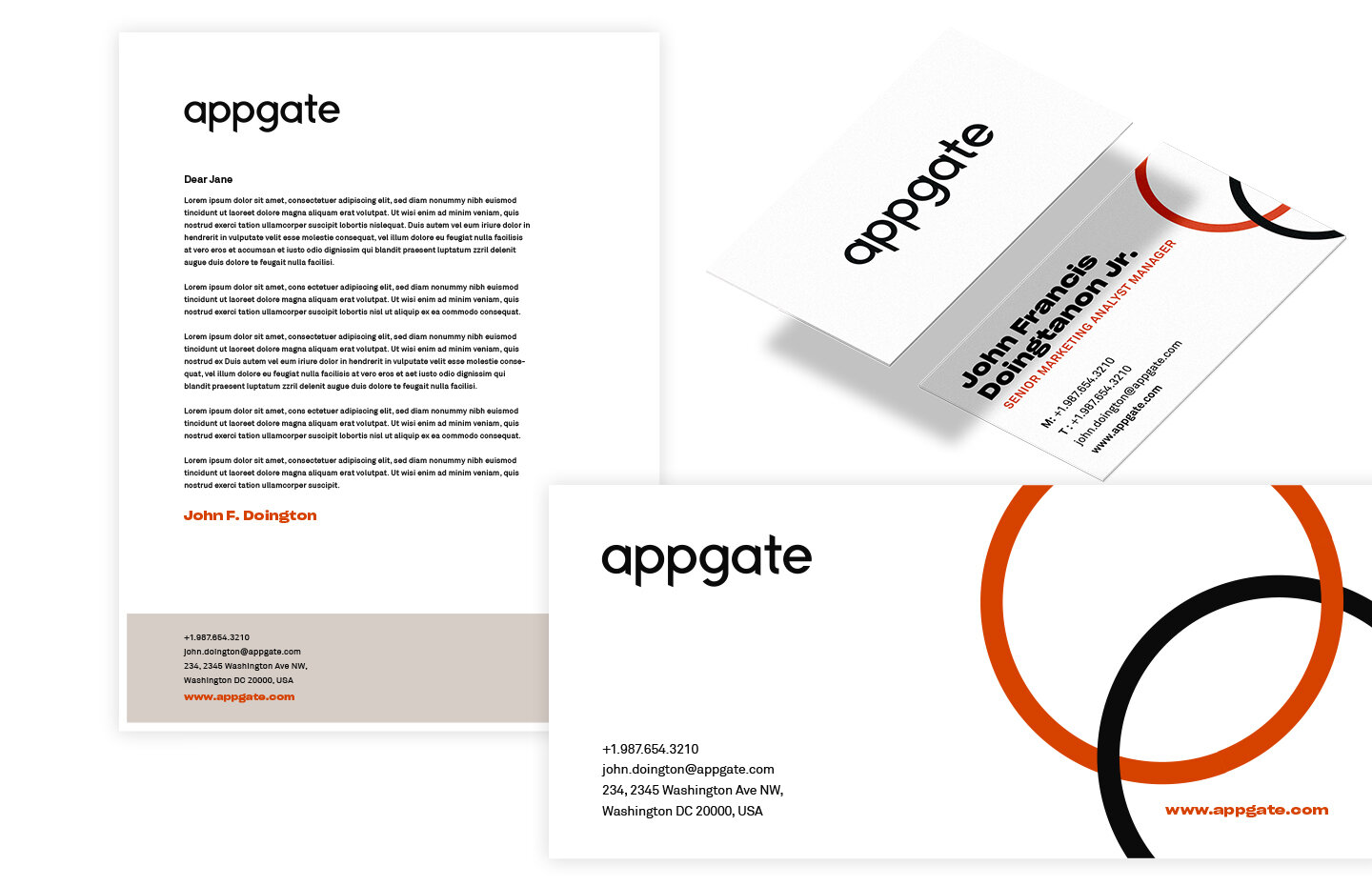
The five circles of the logo tell a story of harmony, interconnectedness, and transparency. They conceptually nod to an evolving brand within an evolving industry. The core graphic ‘Link’ element represents secure access, while the ‘Chain’ of five circles demonstrates partnerships and integrations, and the repetitive ‘Fabric’ feels impenetrable. All together, their brand is minimal, yet bold, as well as humble, yet cunning.
